Moving
I have seriously neglected this blogging thing whilst studying an MA Information Design. I have now created a new blog that is less Publication Design focussed and more about design and life in general. This blog may get retired soon, so head on over to KTC.
Filed under: Uncategorized | 2 Comments
Nice one guys
Congratulations Felix for getting a mention on It’s Nice That. Also to Magdelena and Malin. Looks like Billy Blue is continuing to deliver the goods.
FELIX LOBELIUS
Graphic Design
For a design school I’d never heard of until last autumn, The Billy Blue College of Design in Sydney, Australia is producing some pretty accomplished designers.Felix Lobelius is next up following Malin Holmstrom and Magdalena Czarnecki featured at the end of last year. Pictured is Perspective magazine that ‘sheds light on famous, infamous and unknown personalities in different ways’.
Filed under: Design, Designers | 1 Comment
Tags: Billy Blue, Felix Lobelius
Tell me how you are feeling
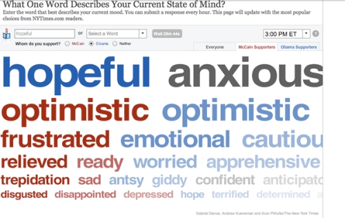
The New York Times have a feature on their website asking readers to submit a word that describes how they are feeling this US election day. They are also asked whom they support, Obama or McCain. Results are displayed graphically with, I assume, the more popular words at the top and in a larger point size. People who support Obama have their words in blue, and red for McCain.
I guess it’s an exit poll of emotion. Link >
Filed under: Infographics, Web | 1 Comment
Tags: emotions, graphics, US election, words
How to ski
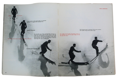
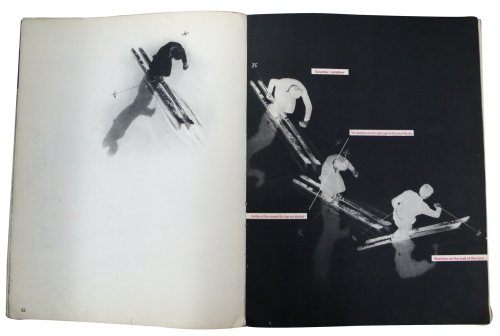
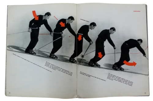
These beautiful pages are from “How to ski by the French method: Emile Allais technic” (1947). Photos and layout was by Pierre Boucher. Emile Allais was a champion French downhill skier and renown instructor who teamed up with Pierre Boucher to make this design classic. Copies of this book go for £300 to £700 in antique shops.
Boucher is an interesting figure in the world of photography. He used techniques such as photograms and solarization to explore the body and to capture figures in a way that would adequately express movement.
This book was generously shown to us by José de Souza who has just completed his PhD here at Reading University, which looked at improving instructional animated demonstrations. He showed us this book as a piece of inspiring instructional design.
Filed under: Design, Infographics, Old Books, Photography, Publication Design | 3 Comments
Tags: Emile Allais, instructional guides, Pierre Boucher, ski
Directories
Last week, Michael Twyman showed us his collection of directories: books such as early phone directories and lists of world publications.
This is the 1943 French street directory. Over 3,000 pages, including yellow pages advertising. Imagine that being thrown over your front fence! Note the printed advertising on the page edges.
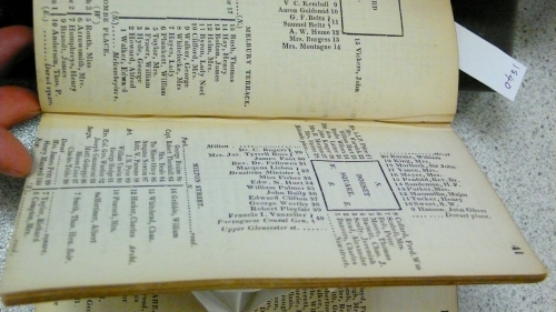
This book was very interesting. It is a directory of the addresses of important people living in London and the way it shows their address is by representing the geographic placement around street shapes. So the bottom of the page shows where people live on a conventionally straight street, and at the top of the page is a where people live around a square.
This was set in moveable lead type. Can you imagine how difficult that must have been to set up?
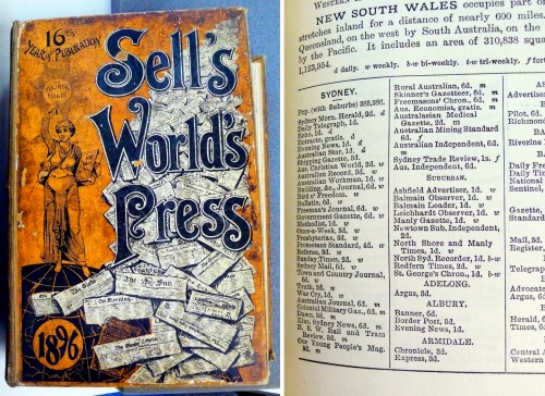
The Sell’s 1896 Directory of World Newspapers was a very interesting read, especially the pages devoted to Australian publications. Note how many newspapers were published in Sydney in 1896 compared to today’s offering. The Sydney Morning Herald was put out twice a day!
Yes, there are many more options available today for receiving news, but never-the-less, it is depressing to see just how small our news media has become.
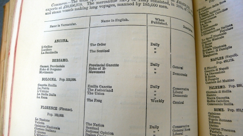
In Italy, the publications of 1896 were listed according to their political leanings. I guess “Comical” is another word for “controlled by prime minister“.
Filed under: Cool Old Stuff, Information Design, Media, Publication Design, Typography | Leave a Comment
Tags: directories, Michael Twyman, newspapers
Lost in translation
Signs in Wales need to be in both English and Welsh. Attention to detail is clearly not one of this council’s strongpoints, as the translation reads “I am not in the office at the moment. Please send any work to be translated”.
Bring back the proofreaders. All is forgiven. Thanks to the BBC for the original story.
Filed under: Design, Wayfinding | Leave a Comment
Tags: translation, Welsh Sign
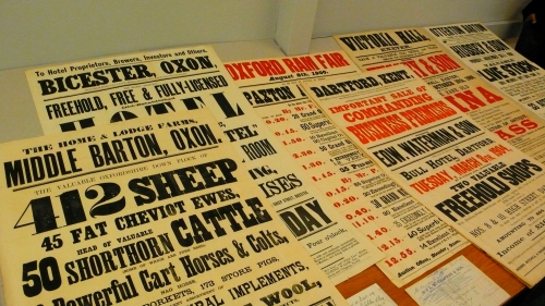
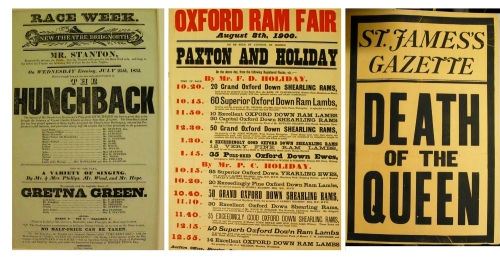
English letterpress posters
Filed under: History, Typography | 1 Comment
Tags: letterpress posters
Doors can be fatal
I was once told that over 300 people a year are killed by swinging doors. I initially thought of the classic swinging doors from saloons in western movies, but I think it was more to do with normal doors opening and cracking people in the head.
Doors can also be fatal to cyclists, and this campaign is trying to raise money in Chicago to inform motorists of the dangers their doors pose to cyclists.
I haven’t yet been “car doored” so I hope that this message rings out loud and clear to the motorists of the world. Look behind you before you open your door. PLEASE!
Filed under: Uncategorized | 1 Comment
Tags: cycling
Perhaps after this video there will be a surge of interest in information design as a career?
“I Love Charts”, from the SID The Science Kid episode “The Sticker Chart.”
Thanks Information Aesthetics for the link.
Filed under: Infographics | 2 Comments
Tags: chart song, Information Design



You must be logged in to post a comment.